Two years ago the UPRacing team decided on a full revamp of the team’s branding. We worked with the team on their new website. Competing in Formula Student events, the team wanted somewhere to showcase their cars, events and provide information to other teams and partners.
UPRacing
- Web Development: ROSE Digital, Ben Staker
- Web Design: Matt Jackson, ROSE Digital (Responsive)
- Branding: Dan Gordon
Displaying the Events
Thinking of ways to visualise data is always good fun!
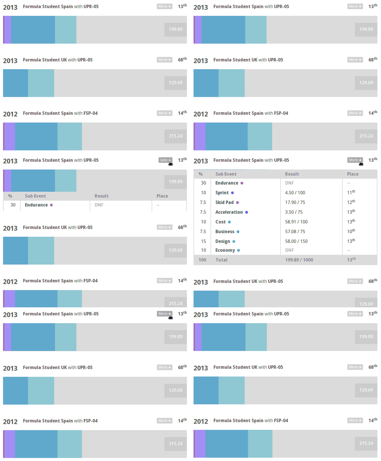
I designed the events page to allow for comparing between events at a glance. Each sub-event is colour coded to a key. The amount the bar is filled represents how well the car did in the event overall.
When clicking more, a table with a break down of the event slides into view. The sub-event name, the result and placement can been seen here.
These visualisations are generated dynamically from a database making it easy to add more events in the future.
Thinking Responsively

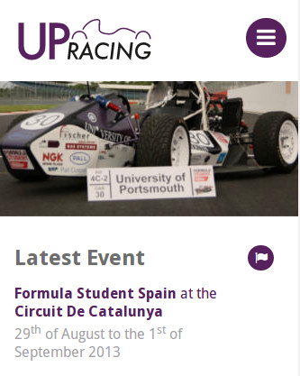
You gotta be making websites an enjoyable experience across different screen sizes, it was important for this site. At events potential partners and sponsors would be browsing on their mobile phones.
A lot of content needed to be reordered. The navigation for example had to be altered, I went for a checkered
flag 
For the content on the site, specifically the blog, I tweaked the text for a better reading experience and made sure the images and videos scaled appropriately.
Mapping
Teams come from all around the world for the Formula Student events.
We had a map at the bottom of the page to give context to where we were based, when clicking on ‘To Silverstone’ or 'To Circuit De Catalunya’ you’re whisked away to that location giving a real sense of how far the team travels.

I implemented the maps using map data from Open Street Maps and Leaflet.js which is great alternative to Google Maps.


